Sales Analysis Dashboard

Description
What - A monthly Sales Analysis dashboard focusing on sales, margins, volumes and conversions summarizes the sales performance for the month which helps to determine the effectiveness of the sales strategy. Usually, the first page of a dashboard contains the most important KPI’s and the others show the trends and figures.
Who - Sales teams, mostly c-level executives, use these reports to find trends and insights to improve the quality of their products and services.
Why - A month dashboard provides a broader feeling of how the sales reps are performing in the long run. It focuses on more long-term measurement of KPIs such as sales cycle length, conversion report, and monthly progress report, among many others.
How - This Dashboard was created by Power BI after data-cleansing step in Power Query.
Input
This data folder has files of sales records from 2014 to 2017. Each file has 2 sheets of sales orders and returned orders.
Output
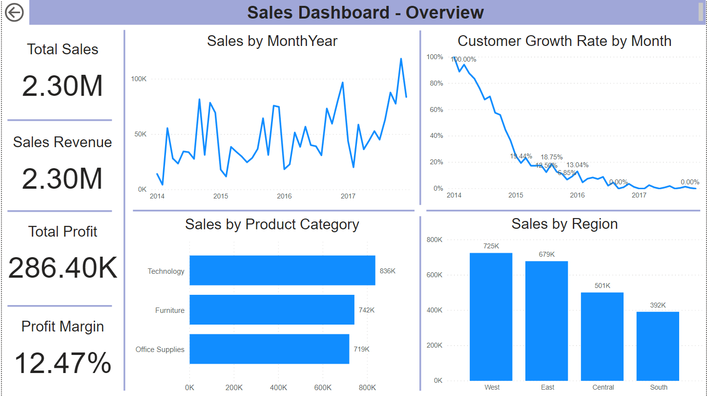
1. Overview
Main metrics:
- Total Sales
- Sales Revenue = Sales - Discount
- Total Profit
- Profit margin (%) = Profit/Sales
- Sales by Order Month (Time Series Analysis)
- Customer Growth Rate by Month (Time Series Analysis)
- Sales by Product Category
- Sales by Region
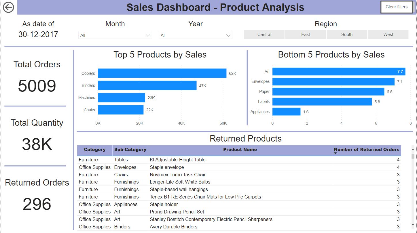
2. Products Report
Main metrics:
- Total Orders
- Total Quantity
- Returned Orders
- Top 5 Products by Sales
- Bottom 5 Products by Sales
- Listing of most Returned Products
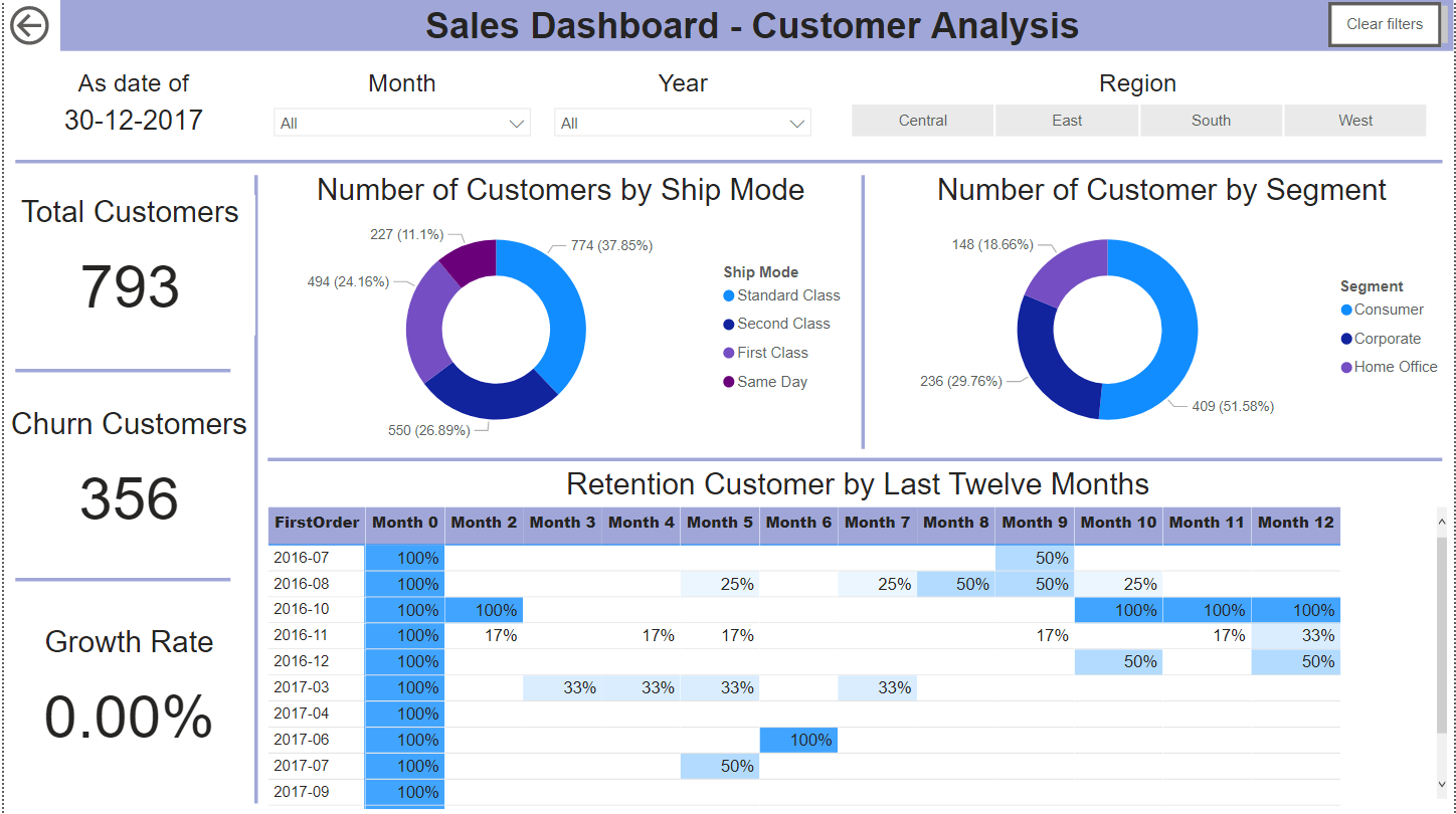
3. Customer Report
Main metric:
- Total Customers
- Customer Growth Rate = Number of new customers/ Number of customers
- Customer Churn Rate = Number of lost customers/ Number of customers
- Number of Customer by Ship Mode
- Number of Customer by Segment
- Retention Customer Rate by Last Twelve Months (Cohort Analysis)
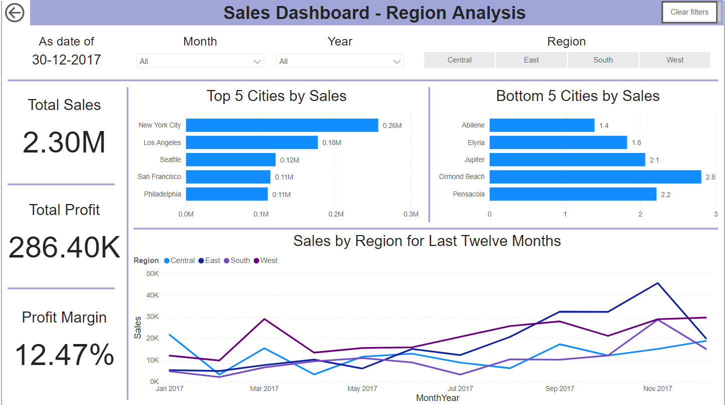
4. Region Report
Main metrics:
- Top 5 Cities by Sales
- Bottom 5 Cities by Sales
- Sales by Region
Preview


